The Art and Strategy of Color in Branding
Have you ever felt instantly drawn to a brand without knowing exactly why? More often than not, color is the silent force behind that connection. From the calming blues of wellness brands to the powerful reds of global icons, color psychology in branding is more than just aesthetics—it’s strategy.
Every shade tells a story, evokes emotion, and influences perception. Whether you’re building a brand from the ground up or refining your visual identity, your color palette plays a defining role in how your audience experiences and remembers you.
In this guide, we’ll explore how to craft a brand color palette with purpose—one that aligns seamlessly with your brand values, captivates your audience and strengthens your presence in the market.

Why Color Theory Matters in Branding?
Color psychology in branding isn’t just about picking pretty hues; it’s a scientifically proven tool that shapes how people perceive, connect with, and engage with brands. Colors evoke emotions, impact decisions, and influence trust—often without us even realizing it. Read more about the science behind colors and emotions at Psychology Today.
For example:
- GREEN represents growth and sustainability, perfect for wellness and eco-friendly businesses.
- RED ignites urgency and passion, commonly used in sales and fast food.
- BLUE fosters trust and reliability, favored by financial and tech brands.
By understanding these effects, you can select a palette that looks good and speaks to your audience’s emotions, creating a visually compelling and psychologically strategic brand.
The Power of Color in Branding
Colors are more than design elements; they are the core of your brand’s identity. Each hue carries a distinct emotion and message. Below is a visual breakdown of how colors influence branding:
Keep reading: Explore more on how colors influence brand perception
How to Choose the Right Colors for Your Brand
Selecting the perfect brand color palette isn’t just about personal preference—it’s about strategy.
I found Coolors to be an incredibly helpful tool. Even if you’ve only chosen two colors, it effortlessly generates complementary shades to create a harmonious and well-balanced palette. It’s a simple yet powerful way to refine your brand’s aesthetic.
Follow these steps to ensure your colors align with your brand’s goals:
1. Define Your Brand Identity
Your chosen colors should embody your brand’s characteristics. Ask yourself:
- Is your brand bold and energetic, or calm and sophisticated?
- Do you want to evoke trust, excitement, luxury, or playfulness?
- How do you want your audience to feel when they engage with your brand?
2. Understand Your Audience’s Perception
Different hues evoke distinct emotions based on cultural backgrounds, industry standards, and demographics. Research your audience to ensure your palette resonates with them. What feels inviting and trustworthy to one group may not have the same effect on another. Testing and feedback can help fine-tune your choices.
3. Analyze Your Competitors
Observing the dominant colors within your industry can help you identify trends while ensuring your brand stands out. While aligning with industry expectations can be beneficial, differentiation is crucial to making a memorable impact.
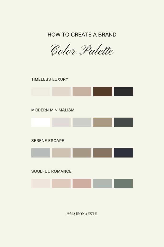
4. Create a Balanced Color Formula
A strong palette typically consists of three main categories:
- Main Colors (1-2): The dominant hues representing your brand’s identity.
- Neutral Colors (1-3): Supporting shades used for backgrounds and typography to provide balance.
- Accent Colors (1-2): Highlight shades that add depth and personality, used sparingly for visual interest.
5. Test Your Color Palette Across Platforms
Once you have your palette, testing is essential. Evaluate how your colors appear across multiple platforms—digital and print—to ensure consistency. A shade that looks vibrant on a website may appear dull in print or clash with other elements on social media. Testing ensures your colors maintain their intended impact across all brand touchpoints.
Real-World Wins in Color Psychology in Branding
Some of the world’s most successful brands have mastered color psychology to enhance their identity:
- Apple: Sleek whites and grays reinforce innovation and minimalism, creating an aura of sophistication.
- Starbucks: The iconic green reflects sustainability, community, and a relaxed atmosphere, reinforcing its brand ethos.
- Coca-Cola: Bold red exudes excitement and passion, making its branding instantly recognizable and full of energy. How Coca-Cola launched her signature Coca-Cola red
Let’s Recap
By carefully selecting and strategically implementing colors, you can create a brand identity that is both visually compelling and emotionally resonant, ensuring your brand remains memorable and impactful in the minds of your audience.


